
File Requirements
Guide to artwork submission and tips
Preferred file type is Adobe PDF. Acceptable applications for Mac & PC include (but are not limited to) Quark Xpress, Adobe Illustrator, Adobe InDesign, Adobe Photoshop and Adobe PDF. Additional charges may apply if furnished media are incompatible with our software. We cannot guarantee consistent results if files are generated by other applications like Microsoft Publisher. For best results, all rasterized files should be converted to CMYK.
All fonts must be included or embedded. Images must be flattened with CMYK in TIFF or EPS format.
Please follow these guidelines to ensure that your project will be printed as you expect and in the quoted time.
Download Templates
We have created templates to help you format your print products, Adobe® Illustrator®, Adobe® Acrobat® and Adobe® Photoshop. Now visit our website to download templates for printing.
UNACCEPTABLE: (72 DPI) Low Resolution.

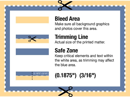
What is Bleed?
Bleeds allow you to run artwork to the edge of a page. On a press, the artwork is printed on a large sheet of paper and then trimmed down to size. If you do not allow for a 1/8 of an inch bleed, any misalignment while cutting will result with the artwork not running to the edge of the paper. Bleeds ensure you get the results you need.
For example, if you have designed a standard 3.5" x 2" business card with a red background covering the whole area, you will need to enlarge that red background to 3.75" x 2.25". This will make the red background extend 1/8 of an inch on every side of the page.
Why is adding a Bleed necessary?
Small mechanical variations can end up leaving a hairline white edge where there should be no white edge at all, if the image is not extended beyond the final trim size. Extending images 1/8" beyond the final trim size guarantees that images truly will go all the way to the edge of the printed paper.
How do I add bleed to my design?
Adobe Photoshop
- Open Photoshop and click File > New...
- Enter the FULL BLEED dimensions. That is, 1/4" extra both vertically and horizontally.
- Set the Resolution at 300 pixels/inch
- Set the Color Mode to CMYK
Adobe Illustrator
- Open Illustrator and click File > New...
- Enter the TRIM dimensions in the Width and Height boxes (for example, the trim dimension on a standard business card would be 3.5" x 2")
- Enter 0.125 for the top, bottom, left and right bleed
- Set the the Color Mode to CMYK
- Set the Raster Effects at High (300ppi)
Adobe InDesign
- Open InDesign and click File > New > Document...
- Enter the TRIM dimensions under Page Size (for example, a standard business card would have trim dimensions of 3.5" x 2")
- If you do not see "Bleed and Slug" at the bottom of the window, click the "More Options" button.
- Enter 0.125 for the top, bottom, left and right bleed
THINGS TO CONSIDER WHEN OVERPRINTING BLACK INK The CMYK color mode is the color mode of paper and press. Printing presses (sometimes referred to as a 4-color press) convert an image’s colors into percentages of CMYK (Cyan, Magenta, Yellow, and Black), which eventually become the color plates on the press. One at a time, the plates apply color to a sheet of paper, and when all 4 colors have been applied, the paper contains an image similar to the CMYK image created in Photoshop. The CMYK color mode can take an image from a computer monitor to a printed document. Before converting an image into the CMYK mode, however, it’s important to understand that you will lose some color saturation during the conversion. The colors that will not print are defined as being out of gamut. To view the areas of an RGB image that will lose saturation values, click the View menu, and then click Gamut Warning. Photoshop will mask all the areas of the image that are out of gamut.
You have probably heard or read that process inks are transparent: that when process inks are laid over one another, they act as filters (somewhat like gelatin filters on theatrical spotlights) to subtract certain wavelengths of light and reflect other colors. This is the nature of process color printing.
However, it's important to remember that not only cyan, magenta, and yellow inks are transparent. Black ink is transparent, too.
When is this important to remember? When you're overprinting a process color image with black ink. For instance, if you print a portion of a large initial capital letter over a 4-color photo, with a portion of the letterform extending beyond the boundary of the image onto the white paper surrounding it, the black ink overprinting the photo will look different from the black ink printed directly on the white paper. In effect, you will see the cyan, magenta, and yellow of the photo through the transparent black process ink.
One way to fix this problem is to use a rich black (a combination of process black ink with an additional percentage of magenta and cyan). Different commercial printers will have their own mixtures (ranging around a 50 percent magenta and/or cyan ink limit), and these rich blacks will be either cooler (more cyan) or warmer (more magenta).
In addition to providing thicker, richer ink coverage than process color by itself (i.e., 100% black plus 50% cyan, plus 50% magenta for a total of 200% ink coverage plus any yellow—as opposed to just 100% black), rich black ink will overprint 4-color process images (or process color screens) without creating a distinction between where they overprint the image and where they overprint the surrounding white paper. (If you specify a rich black in your InDesign file, do check the printer's proof carefully for any color problems.) Another solution would be to manually knock out the 4-color image below any type that would otherwise cover both the photo and the surrounding white paper. To go back to the example above, most print layout applications would print black type over the photo without deleting the image below the type letterform. (This would only be true for black ink. If the overprinting type letterform were any color but 100% black, most page layout applications would knock out the 4-color inks below the overprint.) One can override the default on most if not all layout programs to disallow the printing of black over process colors. In this case, the 100% black letter would print directly on the white paper, whether it is within the boundaries of the 4-color image or outside its perimeter. The portion of the photo beneath the letterform simply would not print. (As long as it is printing process colors on a 4-color press, either of these solutions would cost the same; however, it would still be wise to discuss your options with CSP).
DO NOT SEND: (Borders too Close).
IMPROPER VERTICAL: (Text Reading Down).


Adobe PDF Preset is set to: Press Quality


Follow Us